
Shape navigation
A section that arranges cards — each with an image, title, body, and link — to guide shoppers to the collections they’re after. Well suited to product shapes and silhouettes (straight, wide, and so on) and category-by-category guidance.
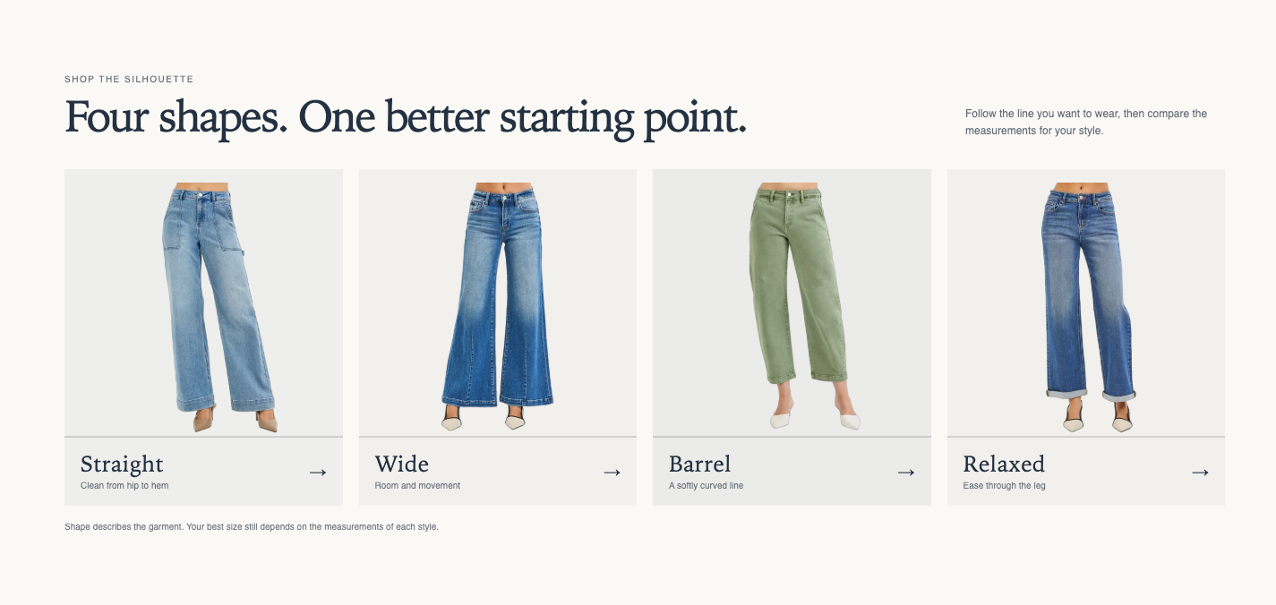
Origin: Hellostore original
How to add it
Section titled “How to add it”It comes pre-placed in the bundled home page and collection page templates. To place it elsewhere, open the theme editor (in the admin: “Online store → Themes → Customize”), and on the page where you want it, choose “Shape navigation” from “Add section”. It can be added to any page type (except header and footer areas).
Settings
Section titled “Settings”- Eyebrow: A small label shown above the heading (e.g., FIND YOUR SHAPE).
- Heading: The section heading.
- Heading size: Choose from Small, Medium, Large, Extra large, or Extra extra large. Default is Medium.
- Text alignment: Choose Follow theme setting, Left, Center, or Right. Default is Follow theme setting.
- Text: Descriptive text for the heading. It appears to the right of the heading on both desktop and smartphones.
- Note: A small note shown at the bottom of the section.
- Anchor ID: An optional name that in-page links can jump to. Use letters, numbers, and hyphens (e.g., find-your-shape, without #). Set another button’s link to “#find-your-shape” and clicking it scrolls to this section.
- Carousel on mobile: When on, shoppers swipe the cards sideways on smartphones. Default is off.
- Color scheme: The section’s color scheme.
Blocks
Section titled “Blocks”Navigation card
Section titled “Navigation card”Adds one card. Up to 8 cards.
- Image: The card’s image. To keep silhouettes consistent, use images with transparent backgrounds or full-body shots
- Title: The card’s title (e.g., Straight). If it is empty and the image has no alt text, the card does not become a link even with a “Link” set (so that no nameless link is read aloud)
- Text: The card’s description
- Link: Where the card links (a collection page, for example)