
About guide
A guide section for About pages that explains the purchase journey stage by stage. Stages follow the order a shopper actually goes through — “before ordering → shipping → arrival → returns” — and buttons can jump to each stage.
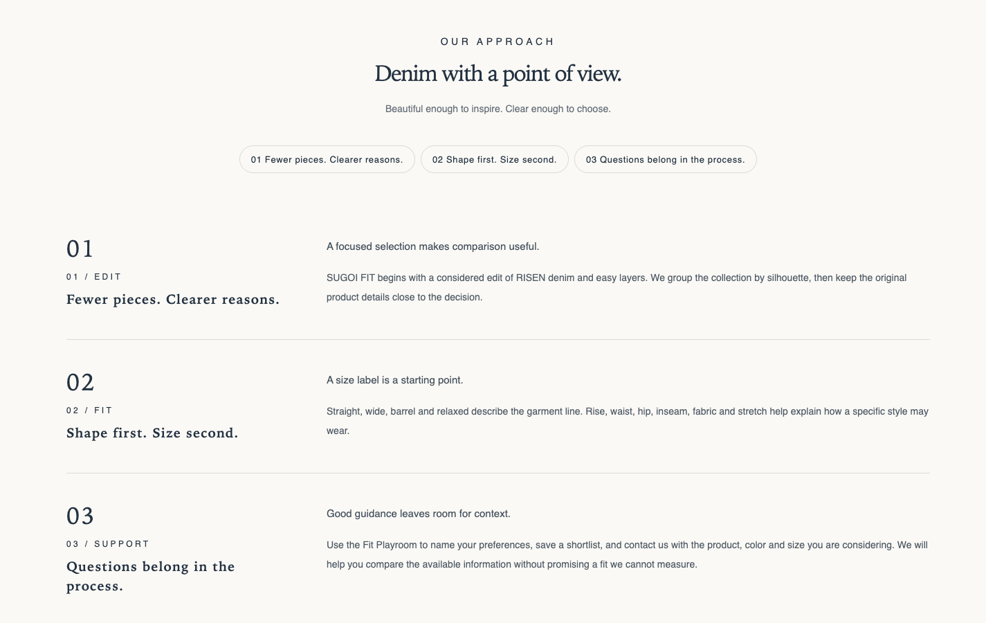
Origin: Hellostore original
How to add it
Section titled “How to add it”It comes pre-placed in the bundled About page template (page.about), right after the Store introduction section. To place it elsewhere, open the theme editor (in the admin: “Online store → Themes → Customize”), and choose “About guide” from “Add section”. It can be added to any page type (except header and footer areas).
Settings
Section titled “Settings”- Layout: Shopping guide (default) lists the stages as a guide. Three-column cards shows the stages as cards (three columns on desktop and tablet, one column on mobile). Jump buttons are not shown with three-column cards
- Eyebrow: Small text shown above the heading. Letters are shown in capitals. Leave blank to hide
- Heading: The section heading
- Heading size: Choose Small, Medium (default), Large, Extra large, or Extra extra large
- Text alignment: Choose Follow theme setting (default), Left, Center, or Right
- Intro text: Text introducing the whole guide (rich text)
- Show jump buttons: Shown only when the layout is not “Three-column cards”. Shows buttons that jump to each stage, and appears when two or more stages have a heading (default ON)
- Closing text: The wrap-up placed after all stages (rich text)
- Closing link label: The text on the button. The button appears only when both this text and the link are filled in (useful for pointing to the Specified Commercial Transactions Act page or a contact page)
- Closing link URL: Shown only when a link label is set. If left blank, the button is not shown
- Outline style: Shown only when both the link label and link are set. On draws an outline button; off draws a solid button (default OFF)
- Color scheme: The section’s color scheme
- Top: Padding at the top of the section (default 36px, 0 to 100px)
- Bottom: Padding at the bottom of the section (default 36px, 0 to 100px)
Blocks
Section titled “Blocks”Stage (limit 12)
Section titled “Stage (limit 12)”One stage of the guide. In the theme editor, choose “Add block → Stage” to add one. Stages display in the order of the blocks.
- Eyebrow: Small text shown under the stage number (e.g. SHIPPING). Letters are shown in capitals
- Stage heading: The heading for this stage (e.g., About shipping)
- Lead sentence: A short summary sentence shown before the body
- Stage body: The detailed explanation for this stage (rich text)