
Store introduction
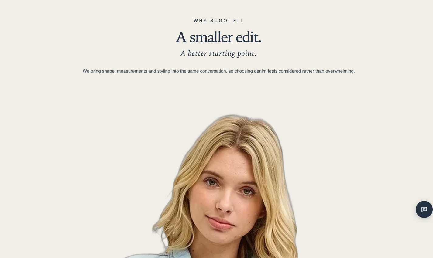
A hero section for the brand introduction at the top of an About page. Alongside an eyebrow, a large heading, an accent line, and introductory text, key figures such as the free-shipping threshold or fastest dispatch can be laid out as a “stats strip.”
Origin: Hellostore original
How to add it
Section titled “How to add it”It comes pre-placed in the bundled About page template (page.about), right below the breadcrumbs. To place it elsewhere, open the theme editor (in the admin: “Online store → Themes → Customize”), and choose “Store introduction” from “Add section”. It can be added to any page type (except header and footer areas).
Settings
Section titled “Settings”- Layout: Editorial (default) places the text and image separately. Image with overlay copy places the heading, accent line, and introduction over the image. Without an image, only the text is shown
- Text alignment: Standard (default) is centered in the editorial layout and left in the overlay layout. Left, Center, Right moves the heading, accent line and introduction together
- Position: Shown only when the layout is “Image with overlay copy” and an image is set. On desktop (750px and wider) it places the heading, accent line and introduction at Top Left, Top Center, Top Right, Middle Left, Middle Center, Middle Right, Bottom Left (default), Bottom Center or Bottom Right of the image. On mobile the copy stays pinned to the bottom of the image. The text alignment follows the position only while Text alignment is Standard; if you choose Left, Center or Right there, that choice wins
- Eyebrow: Small text shown above the heading. Letters are shown in capitals. Leave blank to hide
- Heading: Becomes the largest heading on the page (default: ABOUT). Place this section only once per page
- Heading size: Choose Small, Medium (default), Large, Extra large, or Extra extra large
- Accent line: An italic line shown under the heading. Leave blank to hide
- Brand introduction: The text introducing the page (rich text)
- Text style: How the introduction text looks. Standard (default) is this section’s own size. Body, Subtitle, Uppercase use the theme’s shared text styles
- Image (optional): The section works without one. Position is shown only when an image is set
- Image ratio: Choose Wide (21:9) (default), Adapt to image, Portrait (4:5), or Square
- How the image fits: Fill the frame (default) crops the edges to fill; Show full image shows the whole image without cropping. With the overlay layout the image always fills the frame behind the text, so this setting is hidden
- Image alternative text: A description for customers who cannot see the image. If blank, the alt text saved with the image is used
- Color scheme: The section’s color scheme
- Top: Padding at the top of the section (default 36px, 0 to 100px)
- Bottom: Padding at the bottom of the section (default 36px, 0 to 100px)
Blocks
Section titled “Blocks”Fact (limit 8)
Section titled “Fact (limit 8)”A “value plus description” pair shown after the introduction (and image) — four per row on desktop, two per row on mobile. Use it for the practical numbers shoppers care about — the free-shipping threshold, fastest dispatch, order cutoff times.
- Value: The figure itself (e.g., ¥15,000)
- Label: The short description beneath the value (e.g., The amount at which all orders ship free)