
Recently viewed products
A section that automatically lists the products the shopper viewed recently. Viewing history is stored in the shopper’s browser, so it works without login. Product cards appear from history, newest first, up to the configured count.
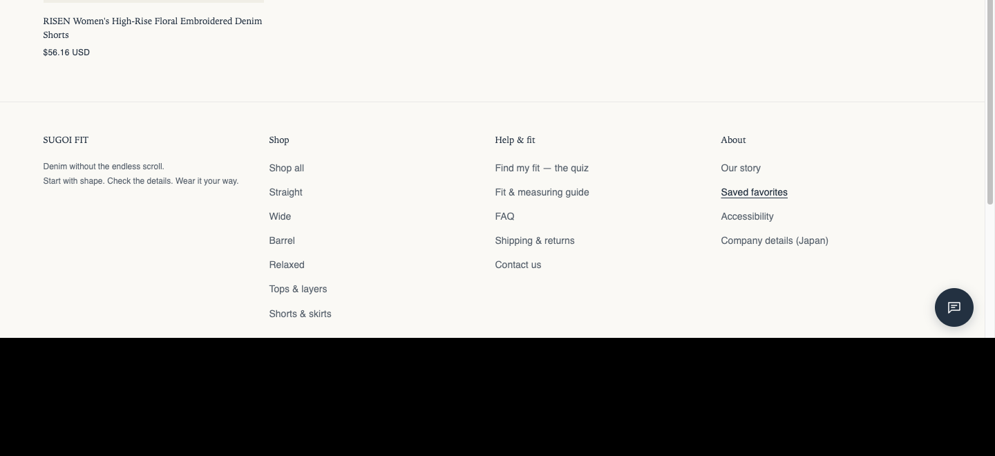
Origin: Based on Dawn, enhanced by Hellostore. It uses Dawn components (variant picker, buy buttons, product cards), so it works the same way as standard Dawn sections.
How to add it
Section titled “How to add it”It comes pre-placed in the bundled “Focus” and “Modern” product templates and on the favorites page (page.favorites). To place it elsewhere, open the theme editor (in the admin: “Online store → Themes → Customize”), and on the page where you want it, choose “Recently viewed products” from “Add section”. It can be added to any page type.
Settings
Section titled “Settings”- Heading: The section heading.
- Heading size: (default: Small). Choose from Small, Medium, Large, Extra large, and Extra extra large.
- Text alignment: (default: Follow theme setting). Choose Follow theme setting, Left, Center, or Right. Applies to the heading. Product card text follows the alignment in theme settings > Product cards.
- Maximum products to show: The maximum number of products shown (default 6, 2 to 6).
- Desktop columns: Products per row on desktop (default 4, 2 to 6).
- Mobile columns: Columns on mobile, “1 column” or “2 columns” (default 2).
- Full width products: When on, the product row spans the full screen width on desktop (screens 990px and wider). The heading keeps its current width. Smartphones are unchanged (default OFF).
- Carousel on mobile: When on, smartphones show the row as a swipeable carousel so shoppers can scroll sideways to see more. Desktop is unchanged (default OFF).
- Image ratio: Choose the product image ratio from “Portrait (4:5) / Square / Adapt to image / Silver ratio (1:1.414) / Golden ratio (1:1.618)” (default: Portrait).
- Show second image on hover: Hovering a card swaps to the product’s second image (default OFF).
- Color scheme: The section’s color scheme.
- Outer top spacing: Space outside the section, above it, in the page background color (default 0px).
- Outer bottom spacing: Space outside the section, below it, in the page background color (default 0px).