
Photo and text story
A section that combines images and prose to tell the story behind a brand or product, or how to choose it. Numbered steps can be listed below the body, and the section closes with a quotation.
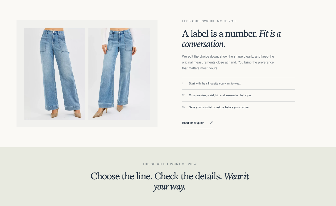
Origin: Hellostore original
How to add it
Section titled “How to add it”It comes pre-placed in the bundled home page template. To place it elsewhere, open the theme editor (in the admin: “Online store → Themes → Customize”), and on the page where you want it, choose “Photo and text story” from “Add section”. It can be added to any page type (except header and footer areas).
Settings
Section titled “Settings”Photos are shown without a frame, with rounded corners, and line up with the text at the top on desktop. On smartphones the photo comes first and the text follows.
- Text alignment: Choose Left (default), Center, or Right. The eyebrow, heading, body, steps and link move together.
- Image: The main image.
- Image alternative text: Describes the image, mainly for screen readers. Entering text leaves the usual visual appearance unchanged. Leave blank to use the alternative text saved with the image. Shown only after you set an image.
- Second image: When set, two images sit side by side. When blank, one image is shown.
- Image ratio: Adapt to image (default) keeps the photo’s own shape. Portrait (4:5) and Square crop the photo to that frame.
- Width: How much of the row the image takes on desktop (750px and wider). Medium (default) splits the row half and half, Small gives the image about one third, Large about two thirds. With two images, Small makes each image narrow. Smartphones are unchanged.
- Image position: Left (default) puts the image on the left and the text on the right. Right puts the image on the right. Desktop only.
- Eyebrow: A small label shown above the heading.
- Heading: The story’s heading.
- Heading size: (default: Medium). Choose from Small, Medium, Large, Extra large, and Extra extra large.
- Body: The story’s body text.
- Step layout: Beside the image (default), or Cards (cards in a row below the image and body; up to 3 columns on desktop).
- Step numbers: Enter per step (default) shows each step’s Number, which can be any text such as 1 or 一. Automatic (01, 02…) and Hide are also available.
- Section color scheme: The color scheme of the whole section.
Padding
Section titled “Padding”- Top: Space above the section (default 36px).
- Bottom: Space below the section (default 36px).
Blocks
Section titled “Blocks”A numbered step listed below the body. Use steps to explain product selection or care instructions in order.
- Step image: An optional image for the step. Only steps with an image show one.
- Number: The number shown only when Step numbers is “Enter per step” (e.g., 1).
- Text: A short description of the step. If a step heading or step body is set, that is shown instead and this field is hidden.
- Step heading: The heading of the step.
- Link destination: A link for the step heading. Shown only after you enter a step heading.
- Step body: A longer description of the step (rich text).
Closing quote
Section titled “Closing quote”Words displayed as a quotation at the end of the section. A color scheme different from the body makes the ending stand out. You can place one.
- Eyebrow: A small label shown above the quote.
- Closing quote: The words shown as the quotation.
- Color scheme: The color scheme of the closing part (default: scheme-2).
A link beneath the body. You can place one. It is hidden when either field is blank.
- Call to action label: The text of the link.
- Call to action link: The link URL.