
Curated products
A section for arranging hand-picked products, chosen one by one. Each product can have an alternate image, a short display title, and a caption — a grid built for merchandising that explains “why we recommend this product.”
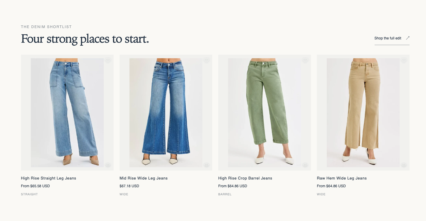
Origin: Hellostore original
How to add it
Section titled “How to add it”It comes pre-placed in the bundled home page template. To place it elsewhere, open the theme editor (in the admin: “Online store → Themes → Customize”), and on the page where you want it, choose “Curated products” from “Add section”. It can be added to any page type (except header and footer areas).
Settings
Section titled “Settings”- Eyebrow: A small label shown above the heading (default: A considered selection).
- Heading: The section heading (default: Everyday favorites).
- Subheading: A short line of text added below the heading.
- Heading size: (default: Medium). Choose from Small, Medium, Large, Extra large, and Extra extra large.
- Text alignment: (default: Follow theme setting). Choose Follow theme setting, Left, Center, or Right. The heading and the text around it move together.
- Product source: (default: Blocks). Choose Blocks or Collection. Collection mode ignores product blocks.
- Collection: Used only when Product source is Collection.
- Product count: How many products to show (default 4, 1 to 12). Shown only when Product source is Collection.
- View all label: The text of the “view all” link beside the heading (default: View all). The link’s look follows the shared theme setting (Buttons → “View all” style).
- View all link: The destination URL (a collection page, for example).
- Full width products: When on, the product row spans the full screen width on desktop (screens 990px and wider). The heading keeps its current width. Smartphones are unchanged (default OFF).
- Carousel on mobile: When on, smartphones show the row as a swipeable carousel so shoppers can scroll sideways to see more. Desktop is unchanged (default OFF).
- Color scheme: The section’s color scheme.
- Image ratio: Choose the product image aspect ratio from “Adapt to image / Portrait (4:5) / Square / Landscape (4:3) / Silver ratio / Golden ratio” (default: Portrait).
- Image padding scale: Scales Photo space amount under Theme settings → Images and videos (100%) from 0-200% for this section only. 0% removes the spacing (default 100%).
- Top: Padding above the section (default 36px).
- Bottom: Padding below the section (default 36px).
Blocks
Section titled “Blocks”Product
Section titled “Product”Adds one product to display. Used when Product source is Blocks.
- Product: Choose the product to display. Used only when Product source is Blocks.
- Image override: When blank, the product image is used. Set this to place an image other than the registered product photos.
- Short display title: When blank, the product name is used. Set this for a shortened label that reads well in the grid.
- Caption: A short description beneath the product (e.g., The most-picked classic).